
Client: Upsy Shopping
Year: 2022 – Ongoing
Role: Product Designer
As the Product Designer for Upsy Shopping, my responsibilities in 2022 and ongoing included competitor analysis, user research, concept creation, stakeholder alignment on product goals, user flow design, visual design, prototyping, user testing, implementation of user feedback into design iterations, and quality assurance. I successfully executed the design of the widget, overhauled the dashboard, and redesigned the marketing website to align with branding guidelines.
UPSY
Project Overview
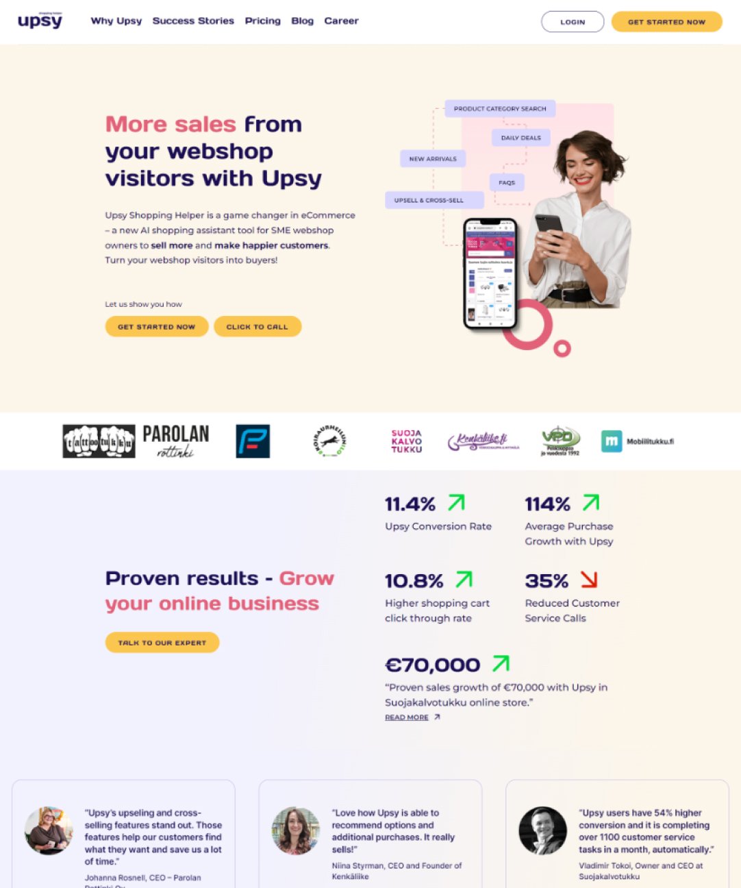
As a seasoned UX Designer, I was tasked with improving the user experience for UPSY – an AI-powered shopping assistant designed to help online stores convert more sales from their website visitors. UPSY leverages advanced AI technology to understand and adapt to customer behavior, making spot-on product recommendations, providing product and FAQ information, and guiding customers through the purchasing journey.
Our target audiences were B2C e-commerce websites with over 100 product types and a monthly revenue of at least 50k. Our end-users were online shoppers looking for a seamless shopping experience.
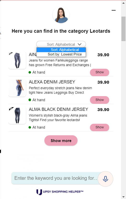
The challenge was to redesign the widget for the e-commerce websites to help customers purchase items with ease, answer their questions, and offer upsell and cross-sell items, removing any obstacles in the process. To achieve this, I conducted research to identify ways to enhance the functionality and aesthetic of the product, resulting in the creation of several solutions and wireframes.
Stakeholder feedback and customer feedback were integral to the design process, leading to iterative changes and the inclusion of new, valuable features.
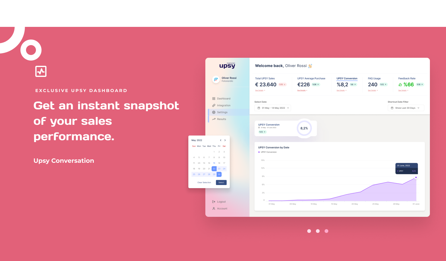
Previously, the dashboard was text-based and hard to navigate, with complex and unrelated metrics. This made it difficult to use, leading the company to manage all setting requests from customers. Our goal was to create a refined dashboard that was user-friendly and easy to onboard. We completely transformed the dashboard, simplifying the functionality and making the metrics easily understandable through the addition of visual elements.
UPSY
The Challenge
UPSY introduced an AI-powered sales tool for e-commerce websites. Its goal was to provide product recommendations, upsell and cross-sell opportunities, and FAQ information to shoppers, all while enhancing the shopping experience. The aim was to help webshops sell more with minimum effort.
Avoiding Chatbot Perception
One of the main challenges was to position UPSY as an AI-powered sales representative, not just another chatbot. Despite being placed in the lower right corner, customers often mistook UPSY for a chatbot and ignored it. To overcome this, we needed to differentiate UPSY's look and function from chatbots.
One of the main challenges was to position UPSY as an AI-powered sales representative, not just another chatbot. Despite being placed in the lower right corner, customers often mistook UPSY for a chatbot and ignored it. To overcome this, we needed to differentiate UPSY's look and function from chatbots.
Capturing Attention
The first step was to attract customers' attention and entice them to click on the widget. Once they did, they would understand that UPSY was not just a chatbot, but a recommendation tool. It was important to make the widget easy to close or minimize without disrupting the shopping experience. We wanted to ensure that the widget was not annoying or intrusive, yet still effectively showed relevant products and increased webshop sales.
The first step was to attract customers' attention and entice them to click on the widget. Once they did, they would understand that UPSY was not just a chatbot, but a recommendation tool. It was important to make the widget easy to close or minimize without disrupting the shopping experience. We wanted to ensure that the widget was not annoying or intrusive, yet still effectively showed relevant products and increased webshop sales.
Limited Space
The widget needed to occupy minimal space while still being large enough to display products clearly. Webshop owners generally preferred a small widget that did not cover up their content, particularly on mobile screens. The design had to be simple and self-explanatory to make it easy for customers to use. The widget and webshop had to work together seamlessly.
The widget needed to occupy minimal space while still being large enough to display products clearly. Webshop owners generally preferred a small widget that did not cover up their content, particularly on mobile screens. The design had to be simple and self-explanatory to make it easy for customers to use. The widget and webshop had to work together seamlessly.
Branding Consistency
Webshop owners wanted the widget to blend in with their design and appear as part of their website, not just an added extension. We had to find a solution that fit multiple webshops while still maintaining UPSY's unique branding.
Webshop owners wanted the widget to blend in with their design and appear as part of their website, not just an added extension. We had to find a solution that fit multiple webshops while still maintaining UPSY's unique branding.
UPSY
Detailed Competitor Analysis
The Detailed Competitor Analysis for UPSY offers a thorough examination of the different products that compete in the AI-powered sales assistant market. This analysis evaluates the strengths and weaknesses of these competitors, as well as their target audience, product features, and market position. By studying the competition, we can understand the market trends and determine what sets UPSY apart from other similar products. This information will be used to develop strategies that allow UPSY to better serve its target audience, stand out in the market, and maintain its competitive edge.
Research
● Context study
● User pain points
● Competitive audit
● Context study
● User pain points
● Competitive audit
Ideation
● Feature narrative
● Design principles
● Journey map UX flow (Wireframes)
● Prototyping
● Feature narrative
● Design principles
● Journey map UX flow (Wireframes)
● Prototyping
Feedback
● Stakeholder reviews
● User testing
● Stakeholder reviews
● User testing

UPSY
The Solution
Designing the solution involved a thorough analysis of the existing interface structure, gathering data on usage and engagement, and conducting a competitor analysis by reviewing successful and unsuccessful examples from other apps. The process was collaborative, incorporating feedback from all team members and leadership.
To validate the solution and ensure it addressed actual customer problems, both in-person and remote testing methods were used. These included screen prototypes, customer interviews, and paper card sorting, which allowed for rapid iteration and idea validation.
The team conducted its own usability test because of the unavailability of research resources. Interview questions were crafted, such as asking the participants their thoughts on UPSY and its purpose, their evaluation of the value it brings, their opinions on missing features, and their overall assessment of the usefulness and visual appearance of UPSY. Additionally, open feedback was solicited. The sales team also performed 1-1 personal demonstrations with clients to gather feedback, which was then used to make iterations.
Upsy has undergone updates based on customer feedback to provide a more relevant and user-friendly experience for shoppers. Several new features have been added, including: - Product categories search - Daily deals - New arrivals - Customer feedback

UPSY
Wireframes
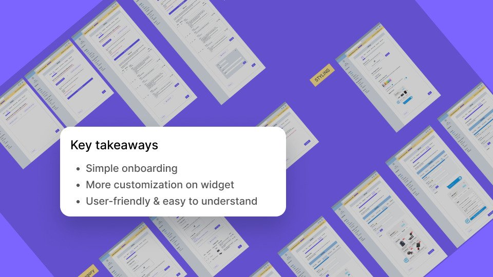
Wireframes are a key component in the design process and play a significant role in the creation of an interface. They provide a visual representation of the fundamental structure of a website, app, or software and serve as the foundation for the design team to further develop upon. The wireframes were created through a step-by-step process for the widget, dashboard, and website design, and the approval of stakeholders was obtained prior to moving forward with the high-fidelity design of the product.
UPSY
Dashboard Screens - Desktop
High fidelity design and prototypes are essential components of the product development process. These designs provide a more detailed and polished representation of the final product and help to validate the visual and functional elements of the design. Our team created high fidelity prototypes based on the approved wireframes, ensuring that all elements of the design were properly aligned and functioning as intended.
UPSY
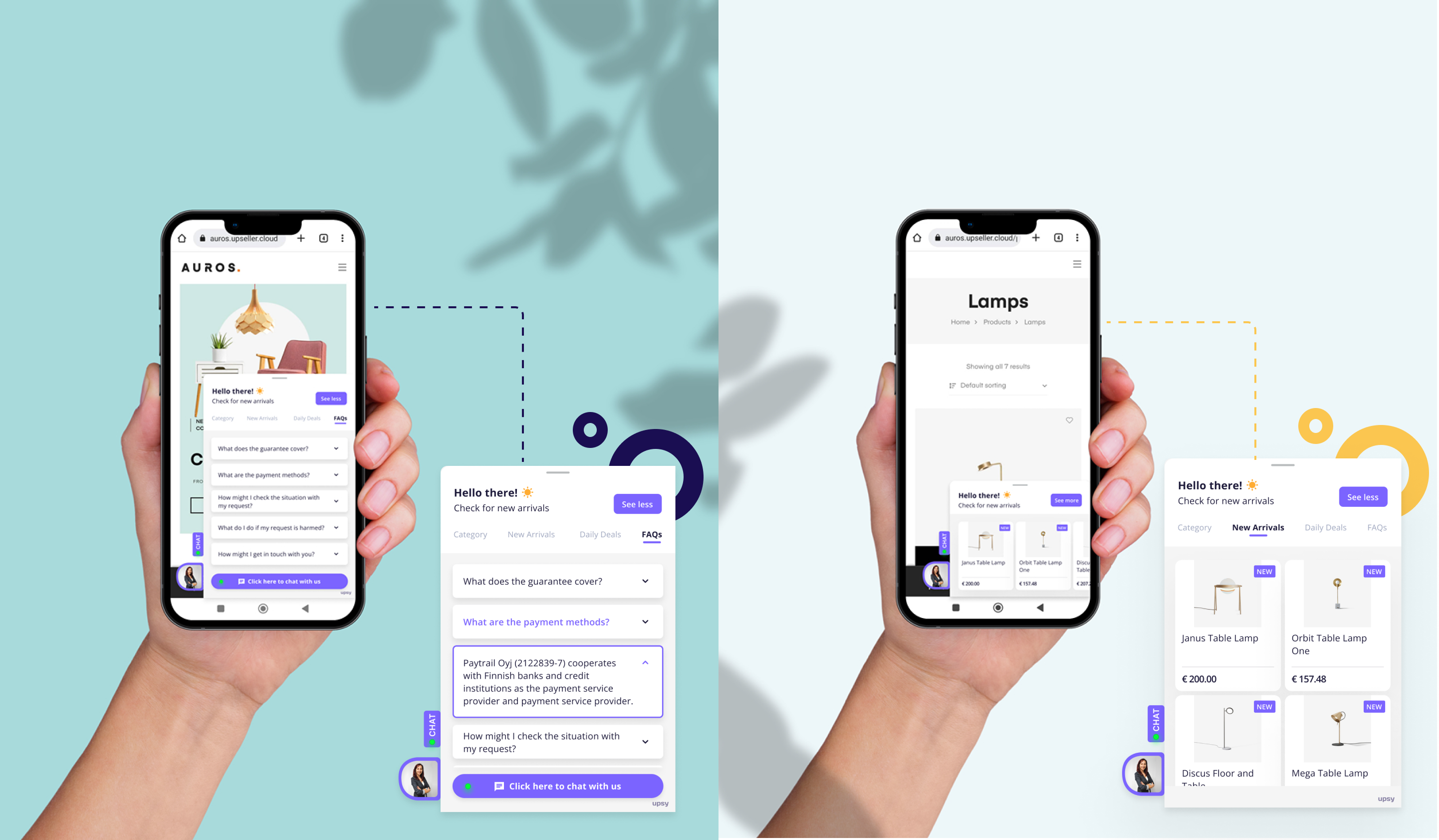
Widget Screens - Mobile
Through a process of testing and iteration, we refined our prototypes with input from stakeholders, end-users, and the sales team to meet all necessary requirements and deliver a smooth user experience. The final outcome was a polished and fully functional design, ready to be implemented and deployed. We monitored usage data to continuously improve the design and make it user-friendly.

UPSY
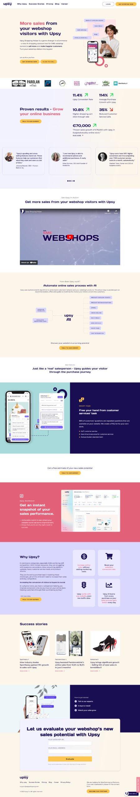
Website Redesign - Desktop
The marketing website underwent a redesign, with improvements made to the product descriptions, views, and content flow. The result of these changes was a significant boost in the website's conversion rate, which increased by 20%. The redesigned website offered a more streamlined and user-friendly experience for customers, leading to increased engagement and conversions. The team closely monitored the website's performance and continued to make iterative improvements to optimize the user experience.
UPSY
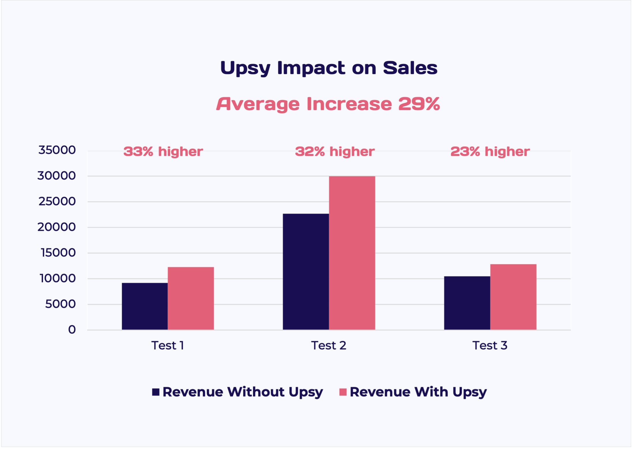
First Results
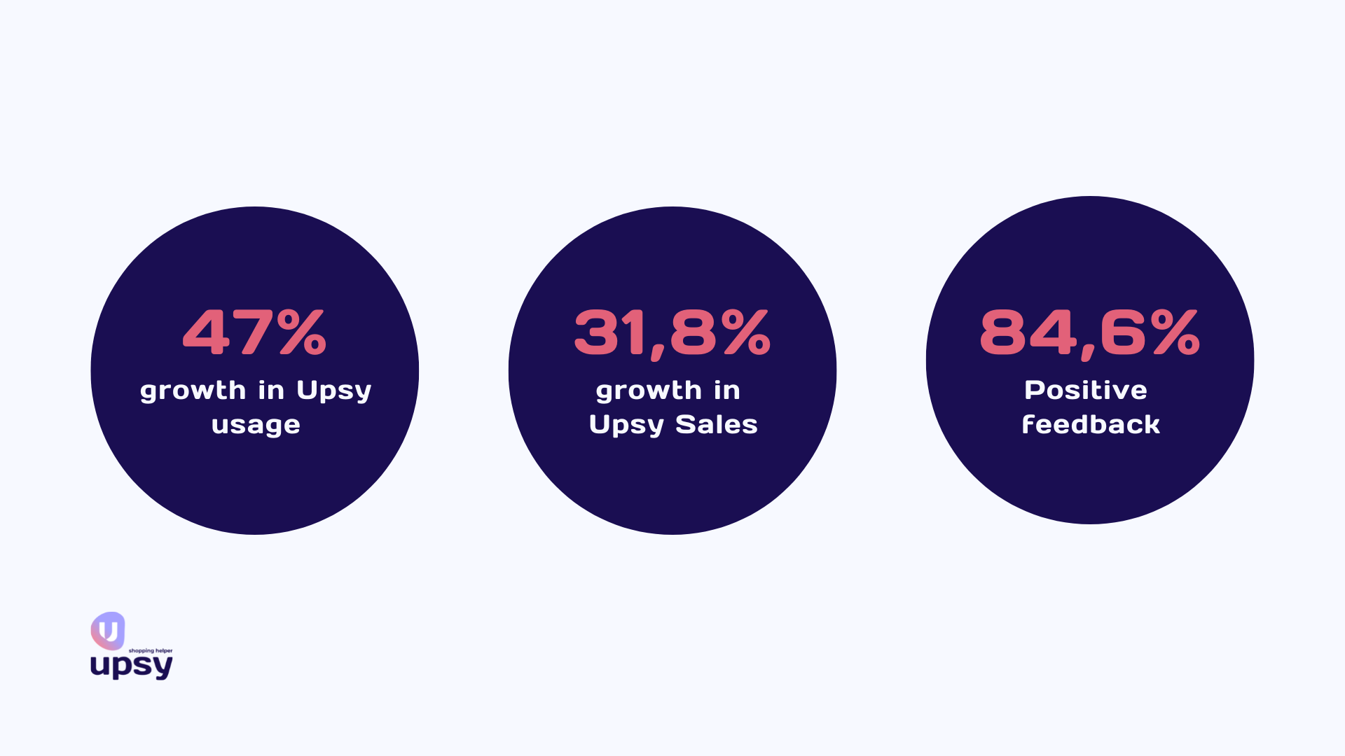
The new design of UPSY was put to the test on one of our webshops and the results were impressive. To test out these new features, Upsy ran a pilot program with 9200 users over two weeks. Upsy’s first results are absolutely remarkable!
The usage increased by 47% compared to the same period last year. While the old Upsy usage percentage was 5.9%, the new version has a usage percentage of 8.7%. More Upsy users mean more sales, more people served, and fewer customer service calls..
The new Upsy brings more sales. The sales which Upsy contributed to the store grew 31.8% compared to the same period of time. This is due to the new daily deals and new arrivals features that have been added to the tool.
Customer feedback has also been overwhelmingly positive. After using Upsy to shop, buyers have the opportunity to provide feedback about their shopping experience. 84.6% of buyers have given positive feedback (indicated by a thumbs up), which is considered a great result.
Upsy is now being rolled out in all webshops.
Need to develop a digital product for your startup or new website for your business?
Experience The Power Of UX – a perfect blend of creativity and innovation!
Let’s talk about your project and see how I can help you to achieve the best results.