01 project overview
Client: UPSY ( SaaS, AI Shopping assistant)
Timeline: 2022 – 2023
Role: Product Designer
Team: Product owner, product manager, 4 developers , product designer (me)
UPSY had built an AI-powered shopping helper—but customers weren’t using it.
My challenge: turn a misunderstood widget into a trusted, high-converting assistant. I led the redesign of the widget (desktop + mobile) and the customer dashboard, while also revamping the marketing website for stronger product positioning.
From research to delivery, I focused on clarity: helping users understand what the widget was, why it mattered, and how to get results from it—fast.
impact at glance – results:
↑ 47% widget usage after redesign
↑ 31.8% growth in assisted sales
↑ 84.6% positive user feedback, post-implementation
↑ 20% increase in website conversion
02 problem
The widget had smart AI under the hood—but no one was using it.
Users mistook it for a generic chatbot and ignored it. Store owners couldn’t see its value, struggled with the dashboard, and often abandoned
setup altogether. Despite solid backend logic, the product wasn’t communicating what made it different—or worth engaging with.
As the lead designer, I was brought in to uncover what was missing, reposition the experience, and help the tool live up to its promise of driving real revenue.
major UX gaps I identified:
🔍 Misidentified Purpose: The widget looked like a support chat, not a shopping assistant—leading to low engagement and instant dismissals.
📉 No Clear Value Prop: The branding and copy failed to communicate why or how the widget could help users shop better.
📊 Confusing Dashboard: Key metrics were buried in dense visuals, inconsistent UI, and hard-to-follow flows—making performance tracking nearly impossible for clients.
🧩 Fractured Identity: Visually, the widget felt disconnected from the site it lived on—like a third-party bolt-on instead of an integrated experience.
It wasn’t just a design problem—it was a trust and clarity problem. My job was to fix both.
03 discovery & research
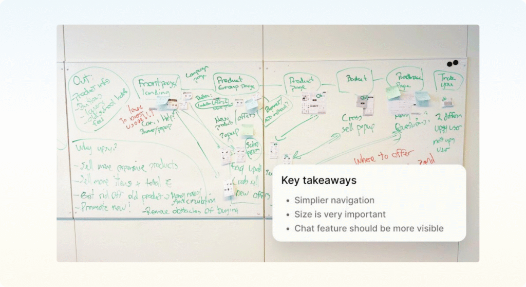
To get unstuck, we had to listen—closely.
I kicked off the project with a mix of qualitative and heuristic research to understand both the widget’s user perception and the dashboard challenges from the store owner’s side.
I paired this with UI audits and competitive benchmarking to identify gaps—and opportunities.
👂 what I did:
- Heuristic evaluation across the entire product: widget, dashboard, and marketing site
- 1:1 interviews with 8 online shoppers and 5 store owners
- Analytics review to spot engagement drop-offs and missed opportunities
- Competitor scan of 12+ e-commerce tools
- Stakeholder workshop to align on product and business goals
🧠 key insights:
- Visual confusion = instant disengagement: Users skipped the widget because it resembled help chat tools they learned to ignore.
- Unclear metrics = frustrated clients: Store owners couldn’t quickly grasp performance—and couldn’t justify paying for something they didn’t understand.
- Unseen AI = wasted potential: The assistant didn’t show intelligence or product value; recommendations felt random or limited.
Everything looked like it was working—but nothing felt like it made sense for users.
That was our north star: bring clarity, confidence, and humanity to a smart but misunderstood product.
04 challenges & decisions
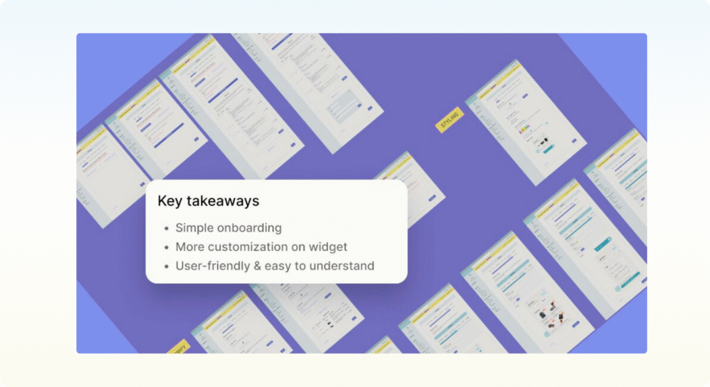
This project had two core focus areas:
1- Making the widget feel helpful, not ignorable
2- Turning the dashboard into a clear, actionable tool
Here’s how I tackled both:
🎯 Widget: Discoverable, but not disruptive
Problem: Most users overlooked the widget or closed it immediately—thinking it was just another chatbot, not an AI assistant designed to help them find products.
My Approach:
- Reframed the entry point visually and verbally to feel like a “shopping guide,” not support.
- Designed contextual triggers based on scroll depth and behavior cues.
- Added lightweight micro-interactions to draw attention without being annoying.
- Empowered the user with quick-dismiss and re-open options for control.
Key Decision Moment: In testing, even the updated widget entry was still being missed. I proposed something risky: show live product previews within the minimized state. → A/B testing showed a +37% increase in engagement.
📊 Dashboard: “Too Much Info” to “What Matters Now”
Problem: Store owners couldn’t make sense of the data—or connect it with revenue impact.
My Approach:
- Prioritized 4 most-used performance metrics, cutting dashboard clutter by 70%
- Redesigned layout with clearer visual hierarchy and trend visualization
- Created new comparison + breakdown views to show change over time
- Reduced onboarding setup from 12 steps to just 3—eliminating major friction
Key Decision Moment: Stakeholders initially wanted to keep all 15 original metrics. I used interview analysis to prove most store owners only referenced 4—sparking a full dashboard restructure.
05 the solution
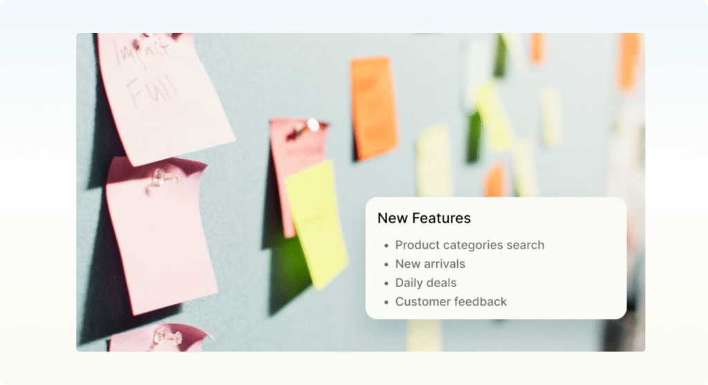
My focus was always the same: make the experience feel intelligent, helpful, and effortless. That meant bringing clarity to three areas: the widget, the dashboard, and the marketing site.
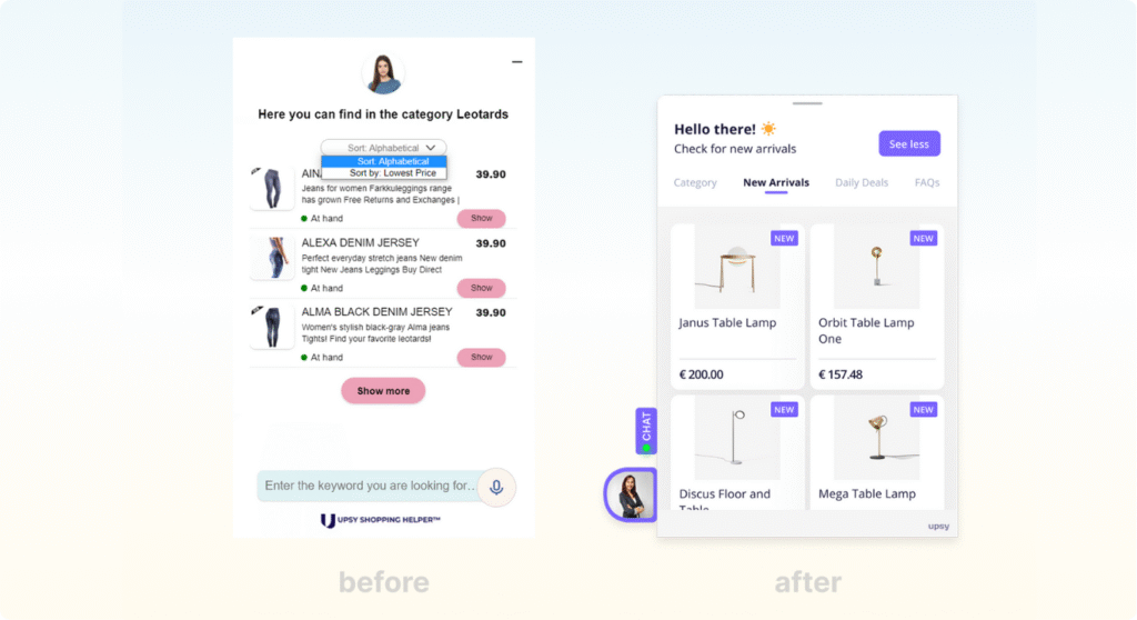
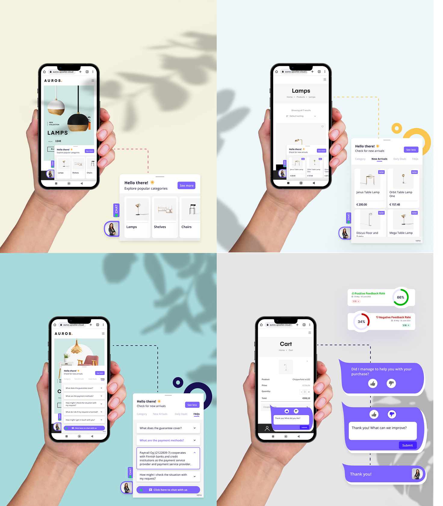
🤖 Widget 3.0 Redesign
A subtle, smart design that guides users instead of overwhelming them.
Core Features I Designed:
- Product previews embedded in the collapsed widget (→ boosted engagement by 37%)
- Visual product search with intuitive browsing by category
- Daily deals carousel to surface offers without forcing pop-ups
- New arrivals feed tailored by user behavior + relevance scoring
- One-click rating for fast feedback on suggestions
Process Highlights:
- Created 3 distinct UX directions, rapidly prototyped in Figma
- A/B tested widget flows with 3 webshops, over 1,000 user sessions
- Iterated weekly based on analytics + qualitative feedback
📊 Dashboard Transformation
From overwhelming graphs to business clarity.
Core Features I Designed:
- At-a-glance conversion metrics prioritized in layout
- Customer journey mapping visualized step-by-step
- Benchmarking & comparison views to show lift over time
- Custom reports with editable modules
- Simplified onboarding (from 12 steps → 3 core configuration moments)

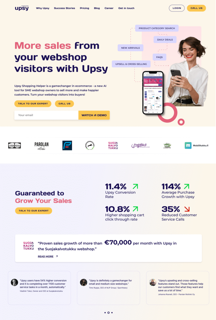
🌐 Website Refresh
Better story = more trust + more conversions.
Key Wins:
- Rewrote value proposition to clearly differentiate widget from chat support
- Created stronger content flow around product capabilities and use cases
- Designed more interactive, trust-building landing sections
- Delivered a 20% increase in conversion rate post-launch
06 result & impact
🧍 For Users
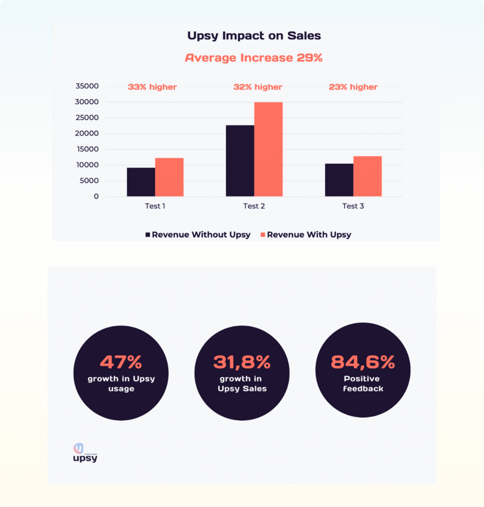
- 47% increase in widget usage after redesign
- 31.8% growth in assisted sales, directly tied to AI suggestions
- 84.6% positive feedback rating across post-interaction surveys
- 20% boost in website conversion rate after marketing refresh
🏢 For the Business
- 28% reduction in customer support inquiries
- 17% increase in average order value
- Improved long-tail product discovery through smarter recommendations
- Clearer performance metrics = stronger client retention and ROI understanding
07 key takeaways
This project taught me how much perception shapes performance. We had strong tech, smart logic—but none of that mattered until users trusted the widget and understood its value. Subtle design decisions—like a product preview or simpler copy—drove measurable results, not just aesthetic improvements.
On the business side, I learned to advocate for simplification in rooms full of complexity. Simplifying the dashboard wasn’t just better UX—it helped clients stay. It reminded me: Good design isn’t about adding more. It’s about getting to the heart of what matters, fast.
From misalignment to clarity, confusion to confidence—this was a project about building trust, through design.


let's connect
Curious to collaborate?
I’m always open to thoughtful conversations and meaningful projects. Let’s explore what we can build together.
