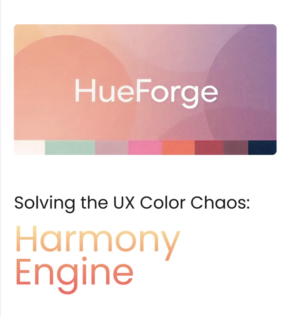
HueForge Harmony Engine Generate complete UX/UI color palettes from a single color
Ever felt that your beautifully branded UI still felt… a little off? Like something was missing, even when using your perfect primary color? I know I have! As designers, we pour so our heart into primary colors, but often overlook the subtle power of our backgrounds, text, and even our “grays.” This tool automatically generates a fully harmonized color palette, from backgrounds and body text to dividers and disabled states. Everything is subtly tinted with your brand’s core color, creating an incredibly cohesive and modern aesthetic.
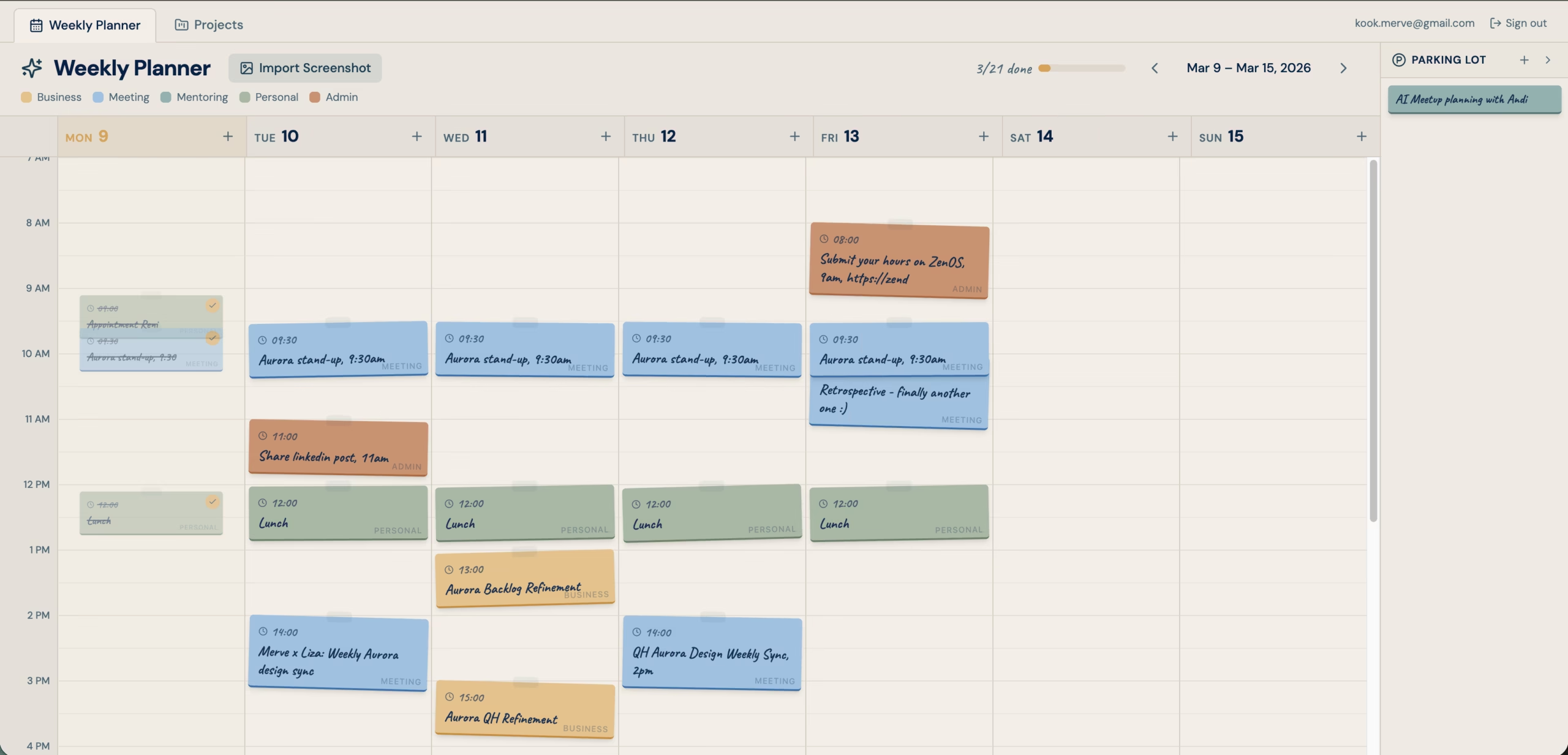
Weekly Planner: Plan your week and progress of your Projects
It’s beautiful weekly planner with colored post-it notes. There are different categories of postits. There is place for Parking Lot, the ideas or to-do’s that doesn’t have definitive time and date yet.
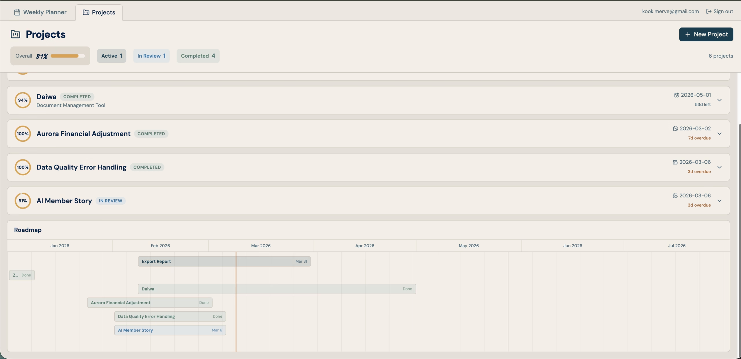
Another tab, we have ongoing projects list and status. We can comment on progress and it’s visually shows where we are and how much capacity we have at the moment. We have also Roadmap view for project deadlines.